Debating the state of the Australian Residential Property market is a national past-time, so with that in mind we will contribute to the debate. This article shows the Australian Residential Property market in a series of charts that compares our market to either historical averages, or other property markets around the world.
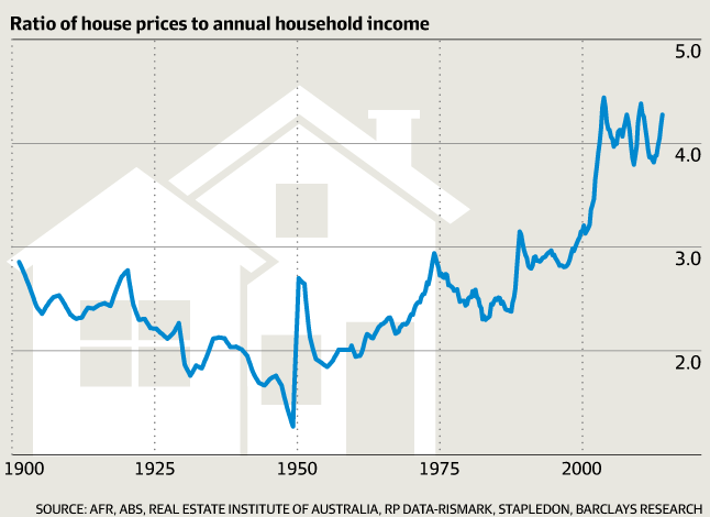
The chart above shows the price of property compared to average income for the last 100 years. Clearly, current pricing is at an all time high relative to incomes.
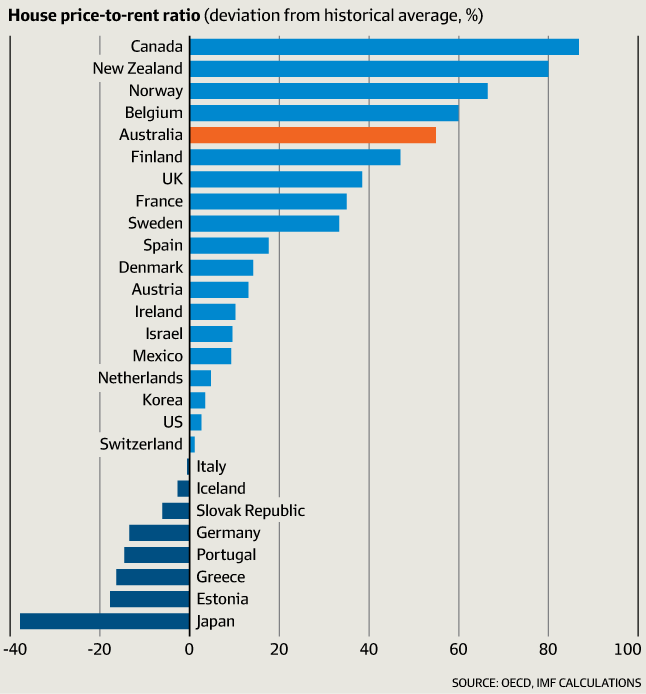
This chart shows the house prices compared to rent received, measured as a deviation from the long term average.
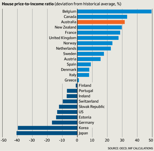
The third graph shows House Price to Incomes, and measured on the basis of deviation from the long term average.
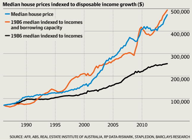
Finally, the chart below shows in blue the value of the median house price in Australia. The Black line shows the median house price in 1986 if it were simply indexed to wages growth. This chart confirms the disconnect between house prices inflation and wages growth. Clearly houses have risen far more significantly than wages since 1986.
We recently asked well known Australian investor Roger Montgomery for his thoughts on the Australian property market - here is a short video with his thoughts.